
Pioneers
Landscape Design and Alternatives
We always intended to design this game in landscape form factor, and not to be printed out.
The images we used were specifically chosen to be viewed on a display somewhere around 1920 pixels by 1080 pixels, and the fonts were sized accordingly.
I think the results turned out pretty well.
However, that’s not going to be a particularly useful form-factor for many people, so we created alternatives using the stylesheets that helped build this project.
The Plain Text Version
The first of two alternatives to the main PDF is the Plain Text Version. This was designed for normal letter-sized paper, 8 1/2 by 11 inches, in two columns.
Even there we were able to add a few visual touches to keep it from looking too plain.
The Pocket Reference
Finally, we designed a version specifically for use on mobile phones and other small screen factor devices.
Our target was 360 pixels wide by 640 pixels high, portrait layout.
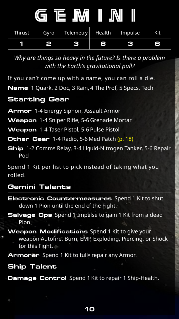
(However, if someone’s on a desktop or laptop computer and they prefer a portrait version with the fancy pictures, this might suit them!)
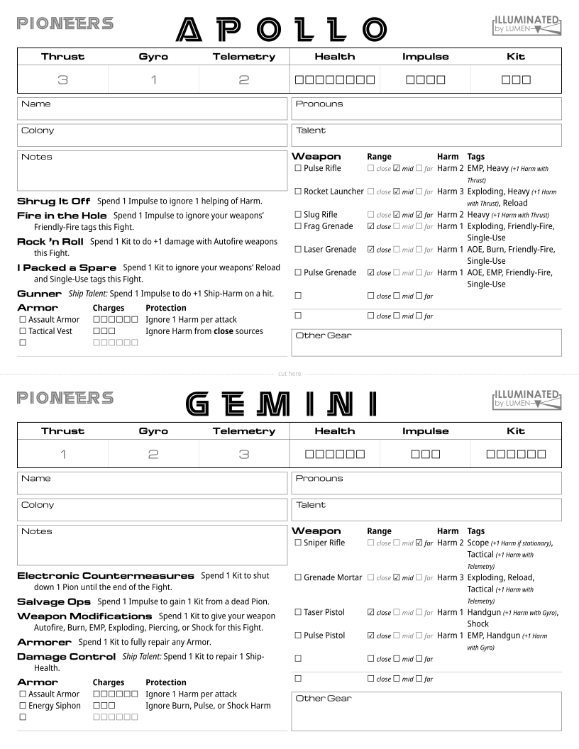
Character Sheet Alternatives
We also created alternatives to the character sheets.
Unlike the text of the game, the sheets are designed to be printed and filled out manually.
The default character sheet uses lighter colored (#e0e0e0) rectangles to indicate where you should put your stats.
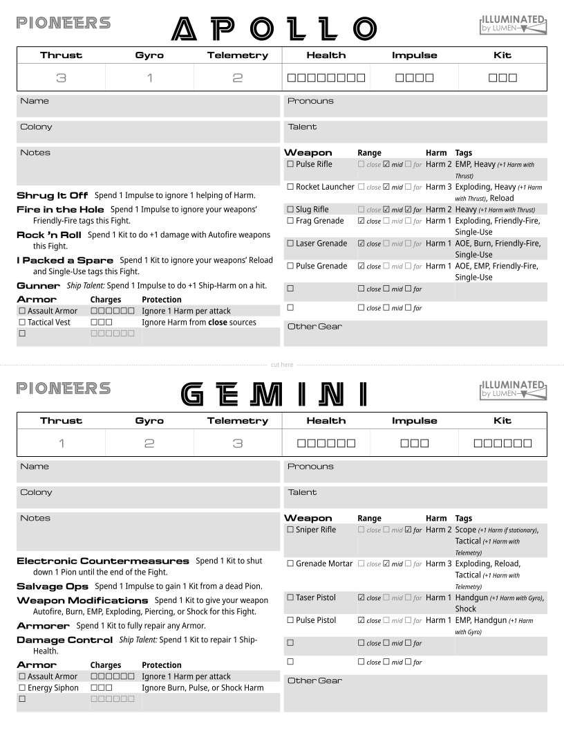
From experience, though, that can be tricky on certain printers – so we made another version that’s the same, except the rectangles are now outlined boxes instead of a solid color.

Comments
Log in with itch.io to leave a comment.
Fantastic considerations for different versions of your documents. I love them!
Thanks!